

The mobile layout of the site uses the <meta> viewport tag:
<meta name="viewport" content="width=device-width, initial-scale=1.0">
content = "width = device-width" – this part means that the page width inherits the width of the device’s screen.
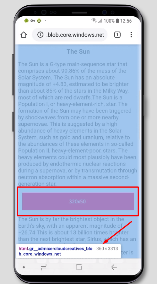
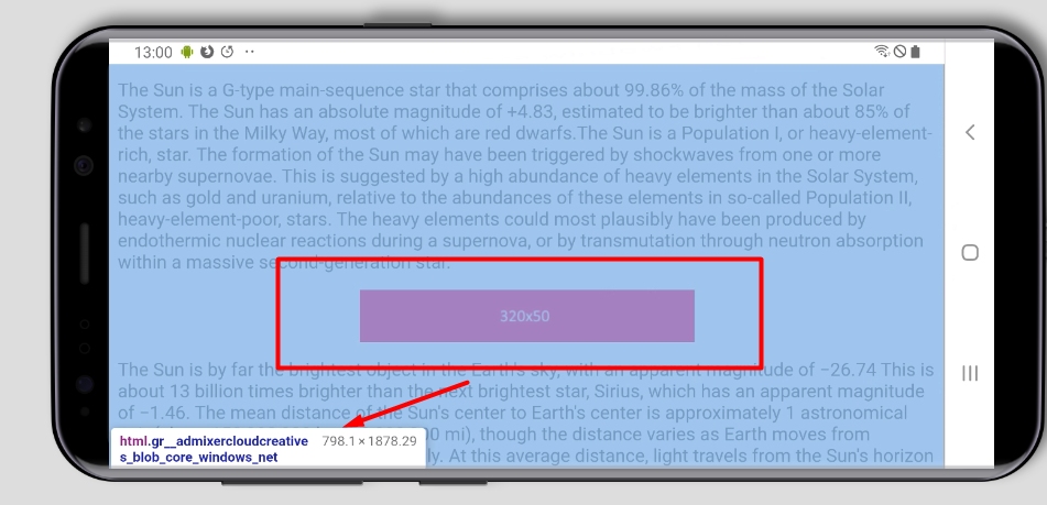
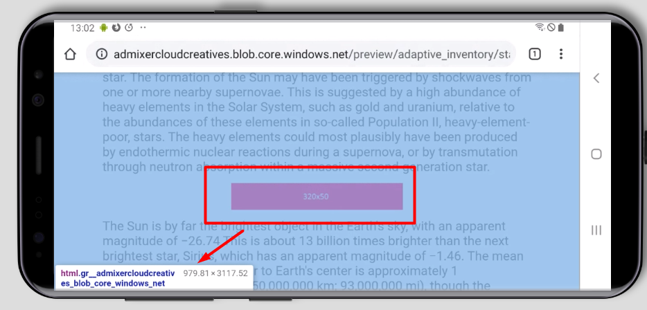
Case 1. Banner image 320х50
The vertical screen orientation
On a page with a mobile layout and viewport width 414px of the screen, it will be rendered in width relative to this 414px
If the page width is not determined by the screen width, then 320px (banner’s width) will be rendered relative to, f.e., 1000px
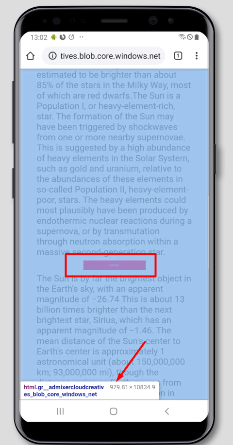
The horizontal orientation of the screen
The banner image won’t resize – it will be the same 320px relative to, f.e., 728px screen.
Examples (on the desktop, open F12 DevTools and apply screen emulation of a mobile device – Toggle device toolbar):
Page with viewport tag
Case 2. HTML5 banner with an adaptive layout
On the platform side, it is possible to select Flexible ad unit size with a width of 0px and a height of 90px, 120px, 200px, etc.
On the page, the creative container will inherit the width of the parent container. The height remains the one that was set in the layout of the creative.
If the width of the parent container is changed depending on the width of the screen (f.e., via Media Queries), then the adaptive creative will adjust in width to the parent container on the page. Thus, one creative can be rendered both in the vertical and horizontal screen orientation.
Preview